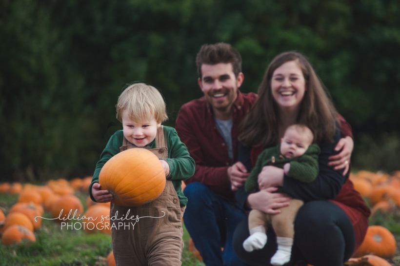
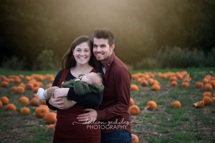
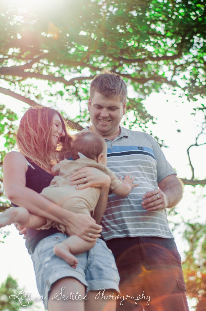
I’ve been taking photos since I met Mabyn Ludke. We became good friends while I was at Syracuse University and like she always did, she spread her love of photography to me. Mabyn is responsible for at least five photographers I can think of–and counting!–for getting them to fall in love to photography. It started with playing around with her camera, to getting my first DSLR (Nikon D60) for Christmas/Birthday, to getting longer lenses and really diving into learning everything I can from online courses!
Now looking back, I’ve decided to take some photos I took of a dear friend of mine, Christa, when I got my first 50mm lens. I love portrait photography, and Christa let me play around with my new lens by using it on her! She’s such a beautiful, natural model, and not to mention an amazing and inspiring Christian woman.
This post is a short comparison between what I knew then and what I know now–and what that means for my photography! Here are six comparisons and a little bit of what I did to make them fit my style today.
1) Colour Control
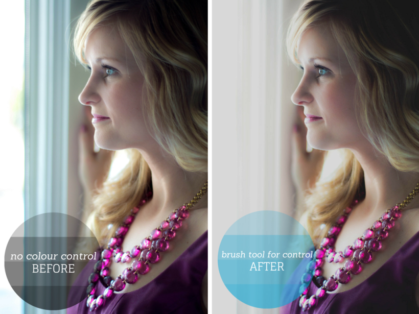
Before, I wasn’t so concerned about controlling every part of my photo and I also didn’t know how to take control of my colour! Now, after having watched Lindsay Adler’s “Taking Control of Color” video, I always look for ways to help focus the audience’s eyes on what I want them to see! As you can tell, the bluish tint from the window in my first edit detracts from Christa’s beautiful profile. With the brush tool and colour picker tool, I was able to desaturate blues and also ‘wash out’ the harsh lines from the window.
2) Bringing Out Colour
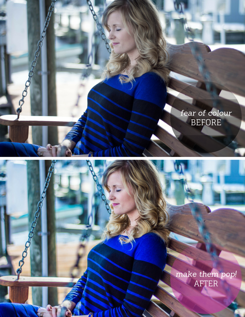
In the beginning, I was very careful not to ‘over-process’ photos. I was highly concerned that over-processing would make photos look fake, unrealistic, and unnatural. Though these are still concerns today; I believe that bringing out colour will really make my photos pop more! I find that people want photos that they can remember, and making colours pop is one way to do that,
3) Tell the Audience Where to Look

In my first edit, I left the photo in colour (also possibly due to fear of change or over-processing). However, when I pulled it out to retouch today, I found the variety of colours (orange in the skin, pink on the lips, blue on the clothing) really detracted from the focus of this photo: Christa’s EYES. So in making this photo a black and white photo, and using the brush tool to bring more clarity and contrast to her eyes, you make the audience notice her eyes.
4) Bring Out the Emotion

I was too afraid to go out of the box as a beginner photographer. These days, I’ve learned that photography not only tells a story, but should invoke and reflect emotions! Christa’s playful and uninhibited laughter was enhanced by using an out-of-the-box filter. I also love the muted look as I think it makes this photo look more like something out of a fashion magazine.
5) Attention to Detail

Two things were lacking in my first photo: smooth skin and crisp eyes. Though the photo itself is absolutely gorgeous, paying closer attention to those details made the photo ten times better! I used the brush tool to smooth out the skin and also bring more clarity and contrast to the eyes.
6) Good Photos Stay
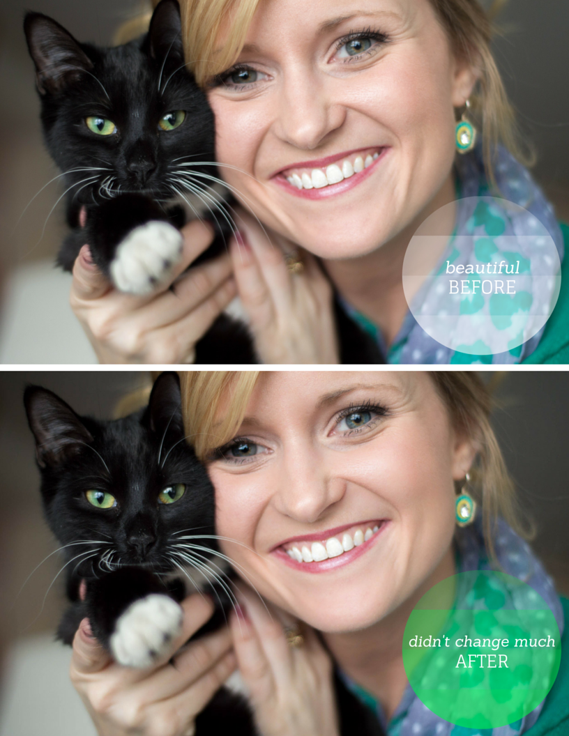
What a gorgeous photo of Christa and her cat! When I saw this photo, I really wanted to re-edit it for this post; but to be honest, I loved it just the way it was! I did make minor changes in smoothing out skin and bringing out the eyes again; but sometimes a good photo doesn’t need editing and can stay the way it is!